
Monday, 27 January 2014

Friday, 17 January 2014
New Year Inspiration
India here - hope that everyone had a great Christmas and New Year.
Here is some stuff to keep you all inspired!
Richie Pope has a fantastic blog, with some technical posts on Photoshop and Palettes for you to look at. The Palette tutorial in particular is very useful, and I will most definitely be using this in my own art.
http://richiepope.tumblr.com/
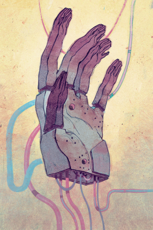
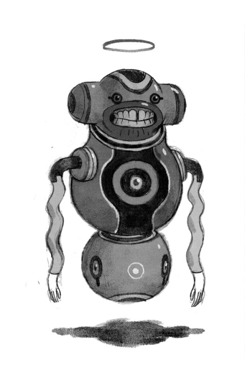
Jake Wyatt - http://jakewyattriot.tumblr.com
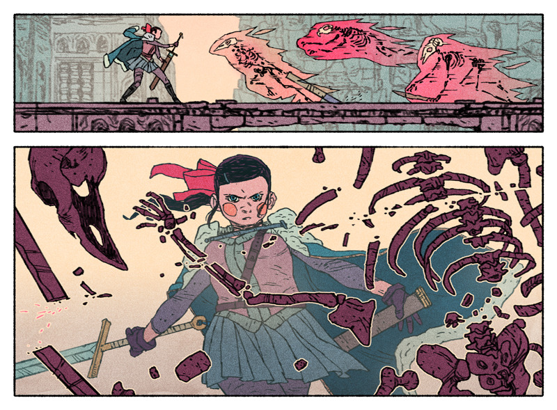
Writer and artist of Necropolis, his comic is going into physical print, and my goodness.... You really have to see it. What beautiful, BEAUTIFUL designs.
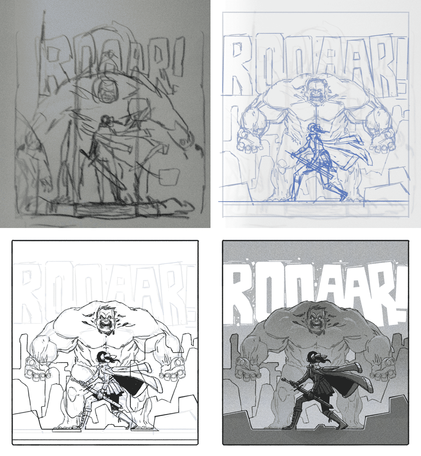
An excerpt from his blog....
'TOOL TIME!!!
DIGITAL
The brush I use for nearly all my PS linework can be found HERE. It’s a mighty brush, and gives a great textured line.
It’s the Pencil: Stumpy 6pt brush, but I usually use it set to about 15pt with a 75% flow for drawing at 300dpi. For background stuff I set it to 20pt to 35pt with a 40% flow and use a lighter hand. This helps the figures appear a little more ‘in focus’ against a grainier, softer background.
TRADITIONAL
When working in the physical world I use 2b-4b lead in .7 MM drafting pencils for figures, and knife-sharpened Blackwing pencils, powdered graphite, and 4b-6b graphite sticks for backgrounds and laying in value.
CASUAL
When drawing from life and in my sketchbook I use either a ballpoint pen or a knife-sharpened black Prismacolor colored pencil. You get a nice, dark, textured, non-erasable line. Plus, Prismacolor pencils are waterproof and nearly smudge proof.
PRETENDING YOU’RE IN WESTEROS
I knife-sharpen my tools because it gives you more control and a variety of edge. It also just feels cool.
If you have to do something dull, like sharpening pencils, it might as well make you feel like Mance Rayder a little bit. Life should be fun.'
Thank you, my good man.
This next blog is one that you should all be watching. http://characterdesign.blogspot.co.uk/
The Character Design Blog interviews a different artist every time on their process and methods. Here are some excerpts from the Claire Hummel interview.

Here is some stuff to keep you all inspired!
Richie Pope has a fantastic blog, with some technical posts on Photoshop and Palettes for you to look at. The Palette tutorial in particular is very useful, and I will most definitely be using this in my own art.
http://richiepope.tumblr.com/
_______________________________________________________________
Jake Wyatt - http://jakewyattriot.tumblr.com
Writer and artist of Necropolis, his comic is going into physical print, and my goodness.... You really have to see it. What beautiful, BEAUTIFUL designs.
An excerpt from his blog....
'TOOL TIME!!!
DIGITAL
The brush I use for nearly all my PS linework can be found HERE. It’s a mighty brush, and gives a great textured line.
It’s the Pencil: Stumpy 6pt brush, but I usually use it set to about 15pt with a 75% flow for drawing at 300dpi. For background stuff I set it to 20pt to 35pt with a 40% flow and use a lighter hand. This helps the figures appear a little more ‘in focus’ against a grainier, softer background.
TRADITIONAL
When working in the physical world I use 2b-4b lead in .7 MM drafting pencils for figures, and knife-sharpened Blackwing pencils, powdered graphite, and 4b-6b graphite sticks for backgrounds and laying in value.
CASUAL
When drawing from life and in my sketchbook I use either a ballpoint pen or a knife-sharpened black Prismacolor colored pencil. You get a nice, dark, textured, non-erasable line. Plus, Prismacolor pencils are waterproof and nearly smudge proof.
PRETENDING YOU’RE IN WESTEROS
I knife-sharpen my tools because it gives you more control and a variety of edge. It also just feels cool.
If you have to do something dull, like sharpening pencils, it might as well make you feel like Mance Rayder a little bit. Life should be fun.'
Thank you, my good man.
_______________________________________________________________
This next blog is one that you should all be watching. http://characterdesign.blogspot.co.uk/
The Character Design Blog interviews a different artist every time on their process and methods. Here are some excerpts from the Claire Hummel interview.


Thursday, 9 January 2014
Film Watch - Exam
Exam is a fantastically well crafted film with a low budget, directed by the up and coming Stuart Hazeldine.
With the use of just a single room, it puts to shame plenty of blockbuster titles with their fancy explosions and glamorous locals. Its limited technical pallet highlights how impressively the writing and pacing manages to keep you engaged right the way through, successfully finding space for all the necessary tension and release.
It has a intelligent premise, which has enough hook and payoff to satisfy by the end, while not trying to achieve a narrative outside the scope of the production.

With the use of just a single room, it puts to shame plenty of blockbuster titles with their fancy explosions and glamorous locals. Its limited technical pallet highlights how impressively the writing and pacing manages to keep you engaged right the way through, successfully finding space for all the necessary tension and release.
It has a intelligent premise, which has enough hook and payoff to satisfy by the end, while not trying to achieve a narrative outside the scope of the production.
Subscribe to:
Posts (Atom)